
Wild Trail
Wild trail is an outdoor recreation experience that provides an escape from day-to-day corporate life and a connection within nature.
The branding is meant to evoke a natural and organic feeling. This highlights the grounding element of the experience while drawing in interest.
industry: Outdoor recreation
branding: total brand package

Wild Trail
Wild trail is an outdoor recreation experience that provides an escape from day-to-day corporate life and a connection within nature.
The branding is meant to evoke a natural and organic feeling. This highlights the grounding element of the experience while drawing in interest.
industry: Outdoor recreation
branding: total brand package
The Brief
wild trail came in looking for a total branding revamp. their old branding felt clinical and cold, they wanted to prioritize an organic, approachable, and earthy feeling for the new brand appearance. logo styles were needed for primary, secondary, and a submark.
the total branding package was completed with a full color palette and typography selections for headings, subheadings, and body paragraphs.


(03) logo pack

Wild Trail wanted to make sure their branding package fully reflected the core of the business and their goals. Fostering a connection to the natural environment rings through the typography choices, color palette, and iconography.
The color palette is composed of earth tones, leaning deep into the different shades of green found in nature. An organic ellipse makes up the iconography, reflecting the rings of a tree, tying in the natural elements to the overall brand appearance.
The Approach
(02) branding packagge

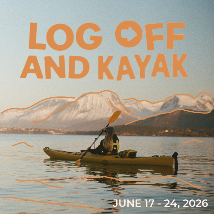

(02) social media post design


The Approach
Log Off & Live came in with a clear concept and strong vision for a social impact campaign focused on encouraging young adults to unplug and reconnect with outdoor experiences. With a strong sense of direction and purpose, they needed support turning that idea into a cohesive brand identity and website that could be launched quickly and effectively.
The goal was to take the pressure off DIY-ing the branding and site and instead create a solid foundation that communicates the mission clearly, builds emotional connection, and makes it easy for audiences to engage and sign up for updates.


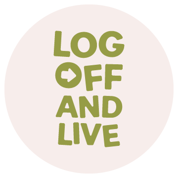
(03) logo pack
(02) branding package
(03) logo pack

The Approach
Wild Trail wanted to make sure their branding package fully reflected the core of the business and their goals. Fostering a connection to the natural environment rings through the typography choices, color palette, and iconography.
The color palette is composed of earth tones, leaning deep into the different shades of green found in nature. An organic ellipse makes up the iconography, reflecting the rings of a tree, tying in the natural elements to the overall brand appearance.